Use Google Chrome to Test Your Website in Various Devices
Most of the people are surfing through mobiles and it is important for website owners or web designers to render their website well in every browser of various mobile devices. To achieve this, as well known to website designers, responsive design comes in to picture. In such design, testing plays an important role in which website should be tested in almost all devices to see how it is being rendered. It is impossible to get all mobile devices at one place and we cannot open our website in it and test it. There might be some extensions available to test your website to see how it looks in various devices. But, those are not needed now. There is a solution for such problem and it can be achieved using Google Chrome’s Developer Tool.

Test your Website in various mobile devices using Google Chrome’s Developer Tool
Google Chrome’s Developer Tool provides you the “Toggle Device Mode” emulation to test your website and see how it looks in every mobile device. It emulates browser in multiple mobile devices and it helps you to see how your website renders in them. Let us see, how it can be done and to make best use of it.
Recommended: 10 Best Google Chrome Tips and Tricks
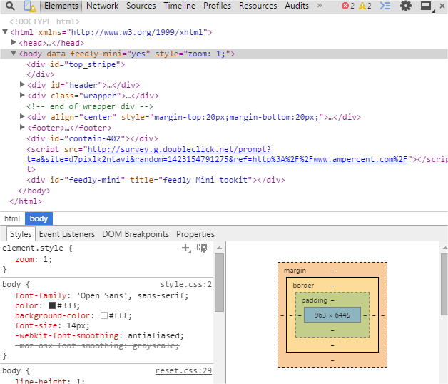
In the first step, open up the website in Chrome, which you want to test in various devices. Once the websites gets loaded, press F12 or right-click on the mouse and select Inspect Element. MAC users press Cmd+Opt+I. This opens up the Google Chrome’s Developer Tool.
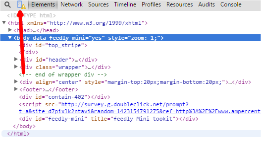
At the top left corner, click on the mobile icon. This is the one which helps us to test our website in multiple devices.
When you click on it, you see that website is shown in the grid mode and it will be rendered in some mobile device by default. Now, you can select the mobile device from the Device dropdown which you want and the size of the screen changes as well. Website will be rendered in that device and you can see how it looks.
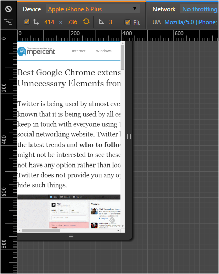
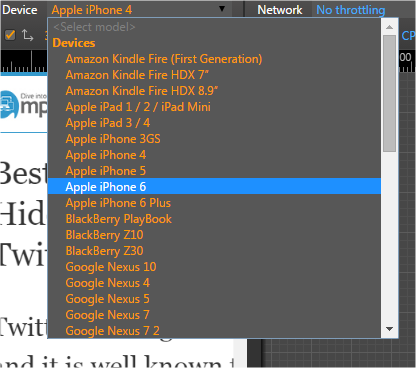
You can select any device from the Device dropdown like popular Apple iPhone 3, Apple iPhone 4, Apple iPhone 5, Apple iPhone 6, LG Optimus and many more like this. Select the one which you want and see how your website renders in those mobile devices.
You can even include swapping dimensions, pixel ratio and other options to test with device mode. You can try various options based on how you want your website to look on browsers of various mobile devices. Based on the device you choose and options you specified, website will be rendered.
In order to exit the Device Mode, simply click once again on the mobile icon. You can even close the Developer Tool simply.
Conclusion
Google Chrome’s Developer Tool is really very helpful for website designers to test the responsive design of their websites and to debug them. You can test and know how your website looks in browsers of various mobile devices by just changing the device type. Almost all web browsers come with developer tool, but Google Chrome’s Developer Tool has more features and it is very easy to use.
Have you tried to test any website on various mobile devices using this technique? Why do not you try with our website? Try it and please do share with us through comments.