Test How Your Website Looks In An iPhone, iPad And Mobile Devices From A Desktop Computer
Ever wondered how your website or blog looks in an iPhone or Apple iPad? Do you want to find how your website looks in a smartphone or whether the mobile friendly theme of your site renders properly on tablet computers or not?
Consumer electronics is growing rapidly among web users and these devices now constitute a significant portion of the entire web traffic. No longer can you ignore a mobile friendly or tablet friendly design of your site because if you haven’t optimized your site for faster loading in mobile devices, you are actually losing a lot of potential readers, customers and hence the conversion ratio is less.
There are so many different tools to test a website’s design on different browsers, resolutions and mobile devices. However, in this tutorial, we will learn how you can preview your site’s design in iPhone4 and Apple iPad from a desktop computer running Windows or MAC. You don’t have to own an iPhone or borrow an iPad from your friend, just because you want to see how your site renders in an Apple device.
Test Your Website’s Design in Mobile Devices From Windows Desktop Using User Agent Switcher Firefox Add-on
1. Open Firefox and install the user agent switcher add-on. Restart Firefox for the changes to take effect.
2. Download this and this list of user agent strings for iPhone, iPad and various other mobile devices. This user agent list is an XML document which will let you change user agent in Firefox to the user agent of an iPhone, iPad, BlackBerry, Nokia, Samsung and other popular mobile phones.
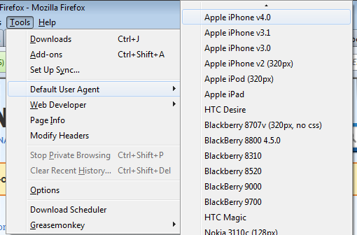
3. In Firefox, go to Tools > Default user agents and click on “Edit user agents”.
4. This will open a small window where you have to click on “Import” and import the XML list of user agents you downloaded in step 2. [ see implementation ]
5. Once you have imported both the lists, you are ready to test how your website looks in an iPhone, Android, iPad, BlackBerry, Nokia and other mobile operating systems. To do this, click Tools. Default user agent and select the device where you want to preview your site’s design
In my case, I would choose iPhone 4.0 which is the latest version of iPhone available at the time of writing this article.
6. Now that the user agent in Firefox is changed to the user agent of an iPhone, your browser works as a mobile device. Open your website and you should see your site’s mobile theme loading in Firefox itself.
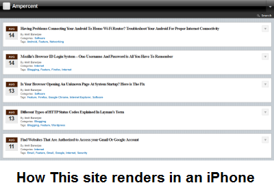
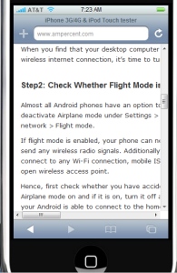
Here is how this site renders in an iPhone, after switching the user agent in Firefox to iPhone 4.0
You can continue your tests by changing the user agent to iPad and reloading your website. But before testing your site’s design in iPad, remember to disable Adobe Flash plugin because Apple iPad’s do not support Adobe flash content e.g YouTube videos.
I checked the design of this site using BlackBerry, Samsung, Nokia and MAC browsers. The results were very impressive as some devices reacted differently to style elements and syntax. By previewing your site across different devices, you can arrive on a conclusion whether your site’s design is optimized for a specific device or whether there are design and render related issues in your HTML template.
Use A Web Based Mobile Emulator To preview how your Site looks in iPhone, iPad and Tablets
 Another alternative way to test your site’s design in diffferent mobile devices is to use a web based emulator of the device for which you want to test your site for. If you want to check how your site loads in a Blackberry phone, you have to use a web based Blackberry emulator, and so on.
Using the emulators are simple, all you have to do is open the emulator from your browser and enter the URL of your website in the emulator options. Normally, the emulators would then load your site the same way it loads in an actual mobile or tablet device.
Here is a list of web based emulators for iPhone, iPad and Android:
- iPhonetester.com – Web based iPhone emulator, ideal for testing your site’s layout in iPhone
- iPadpeek.com – web based Apple iPad emulator which can be used to preview your site’s layout in iPad.
- Android emulator – Follow the instructions in this article to install an Android emulator on Windows and test your website in the emulator.
Using Opera Mobile Emulator To Test Your Site’s Design in Mobile And Tablet Devices
This is one of my favorite way to check the design of any site, as it appears in a mobile or tablet device. The best thing regarding Opera emulator is that the software will automatically adjust the resolution and the screen size of your desktop to fit exactly like a tablet or mobile screen. Here are the steps that need to be done:
1. Download Opera Mobile Emulator for Windows and install it on your computer.
2. Launch Opera mobile emulator and choose the name of the device in which you want to test your website’s design. [see implementation]
3. Click Launch and Opera mobile emulator will launch your site as it looks in the device you have just chosen. Here is how this site appears in Samsung Galaxy Tab, note that YouTube videos haven’t rendered properly.

How do you test your site’s design and usability on mobile devices? Share your tips, suggestions and ideas in the comments section.
Excellent post. I love this. Thank you sooooooooooooooo much for sharing this.